leadership | creative | strategy | resumé
Good execution is measured, not felt.
A leader with +10 years of experience in visual narrative, interaction design UX fundamentals and pitch/pursuit. I lead by example and expect my teams to learn and teach from and for one another. I believe we spend too much time trying to be perfect and that hampers the spontaneous creativity of the things we deliver, leaving less time to respond to the voice of the user, with one true north.
I want to help a team become better aligned, more resilient and more focused on delivering something the end-user can understand and ultimately enjoy using .
the.work.mutual/mobile
Hunter Douglas ˆ
Prototype design: design direction, UIUX, prototyping
Dev Architect: Thaddeus Ternes
UIX: Grant Nicol
Hunter Douglas owns the premium window covering market and needed to refine the installation UX for their powered shades, network Hubs and Remotes for their professional installers.
The problem to solve: Assuming the role of installer/homeowner–test the physical and digital implementation for improvements as well as establishing long-tail ins for voice skills, predictive autonomy and future builds.
The idea: Install the shades in a wooden frame to simulate a test environment (our window at the office) of a home with multiple shades. Run the software and hardware over and over, find the fall-offs and make the app the focal point of the experience to remove all friction and barrier for installers.
The testing: Small and fast was the order. After the shades were installed, we began documenting how to duplicate the physical remote and hub with an app that controlled all.
The output: The process had many points of friction for the user–surely more than would be acceptable for the average homeowner to accept as a DIY install. The combination of the physical install, the network provisioning and the app connections made it clear this was not a consumer-ready product.
The outcome: Our findings revealed the the HD setup was not ready for consumers and our recommendation was to provide the how-to steps as a protected page only for verified installers until the hardware ease-of-use and provisioning caught up to the process prototype.
Southwire ˆ
Prototype design: client integration, UIUX, visual design
Dev Architect: Daniel Wilson
UIX: Jess Moss
Southwire Corporation, the largest supplier of copper and aluminum wiring in North America wanted to move their 6 year old iPad app to the Cloud as a Progressive Web App.
The problem to solve: Create feature parity from iOS to web, make UX improvements in the IxD, build a Phase 2 backlog roadmap and create a repeatable design language for use in a suite of child products. 6 sprints, including a sprint 0 discovery.
The work: UXD Team began with an audit of the previous app, mapped that and began the process of overlaying the requirements plus our experience improvements.
Visual Design Team worked in parallel to take the audit and create our list of components for the DL.
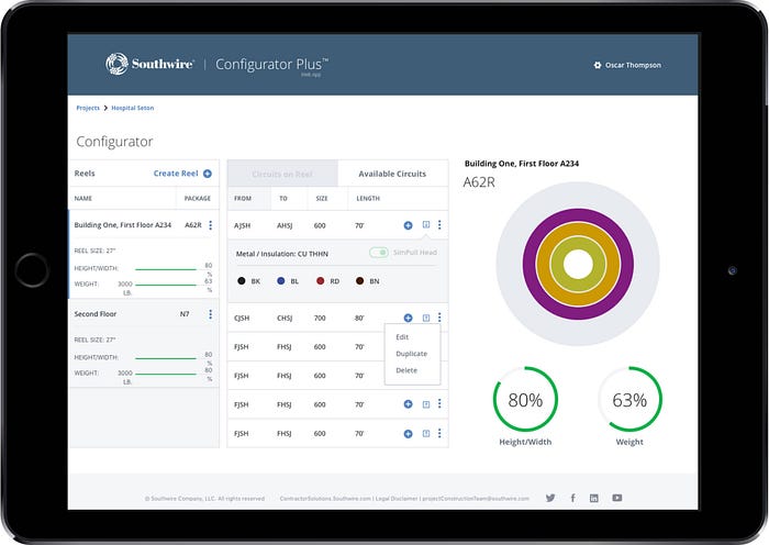
The outcome: The MVP was delivered with cloud-based storage and save, the PWA began testing in both mobile and rugged laptop browsers in early 2019.
the.work.account@ibm
makers mosaic
cognitive business coach
multishare assessment
welcome watson
Makers Mosaic ˆ
Event activation interactive: creative direction, UIUX and visual design
Creative Strategist: Steve Meier, Erin McElroy(IBM)
Dev Architect: Connor Hood
Event installation and design: George P Johnson
My role was as Creative Director and UIUX/visual design. I worked with our strategist, lead dev and producer to bring this together over a five week concept-to-delivery rollout for the IBM SXSW Cognitive Studio.
The problem to solve: fill the audiences awareness and knowledge gap about how using Watson APIs in their products and services could sharpen their competitive edges and improve their output.
The idea: showcase Watson APIs on Bluemix and their application for business transformation through real-world examples and a personalized event experience.




Cognitive Business Coach ˆ
Interactive: strategy, pitch concept & visual design
CD, UIX Design Lead: Paula Ring
IA: Rufus Walker
Creative Strategist: Blaine Prince
Dev Architect: Connor Hood
My role was as Creative Director, conceptual pitch, conceptual design, implementation design and creative strategist. I worked with our strategy team, lead dev, producer and a crack squad of digital designers to produce this elegant experience.
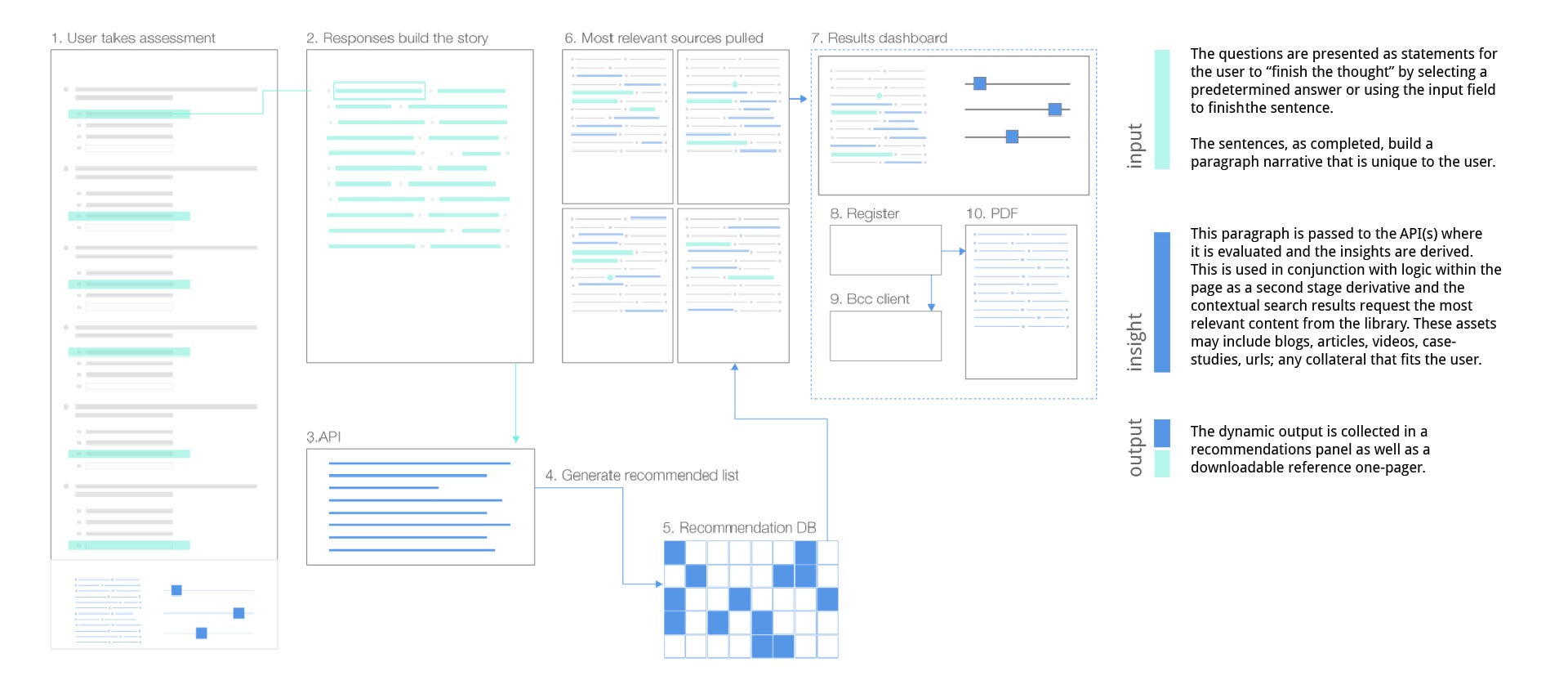
The problem to solve: standard assessments provide little engagement for “discover and learn”audiences, require too many questions be answered thus encouraging abandonment and provide no personalized input or output for the taker or the giver.
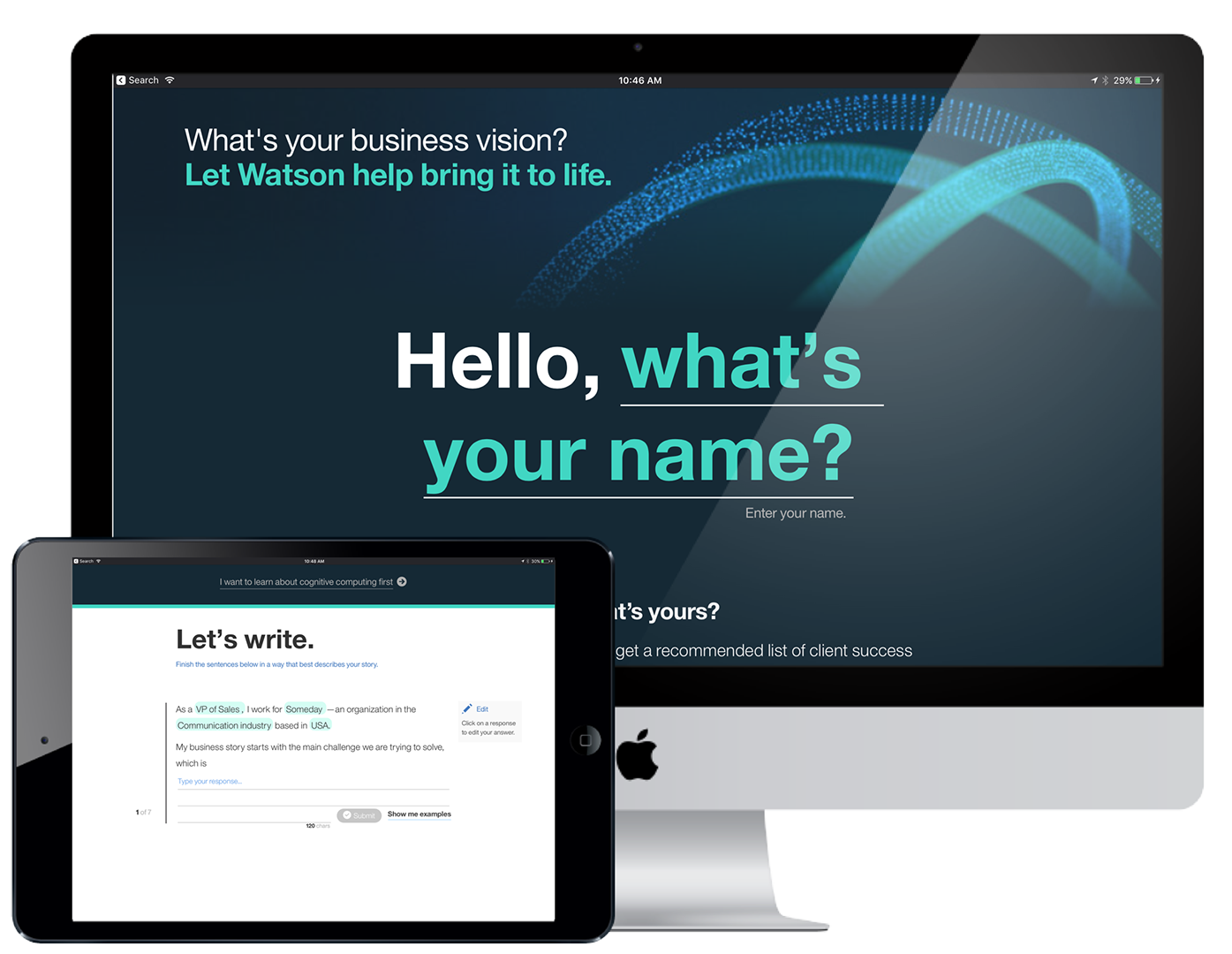
The idea: defeat assessment fatigue with an experience that uses natural language and machine learning APIs to drive case study recommendations and decision mapping with a personalized result for the taker and unique-to-the-individual information for the giver.
Multishare Assessment ˆ
Interactive: strategy, pitch concepts design
Senior Design Lead: Ryan Tillet
IA: Rufus Walker
Concept Strategist: Blaine Prince
Dev Architect: Connor Hood
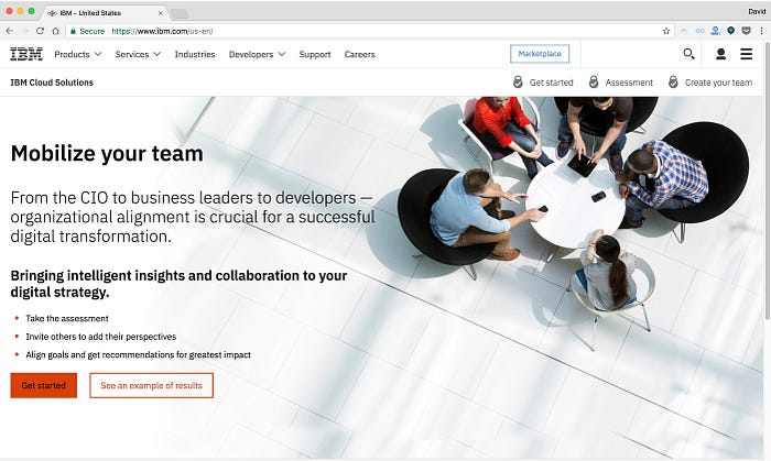
My role was as Creative Strategist and conceptual UX designer. I worked with our account and bus-dev teams to propose, win and build the first multi-share and plan the upcoming versions with added features, better analytics and more ways to engage the audience and their teams.
The problem to solve: Influencer/advocate audiences needed a fast and easy way to evaluate their personal role goals, share with colleagues, match their efforts and shortfalls and walk away with a collaborative experience that gives them an internal marketing proof to take to their decision-maker.
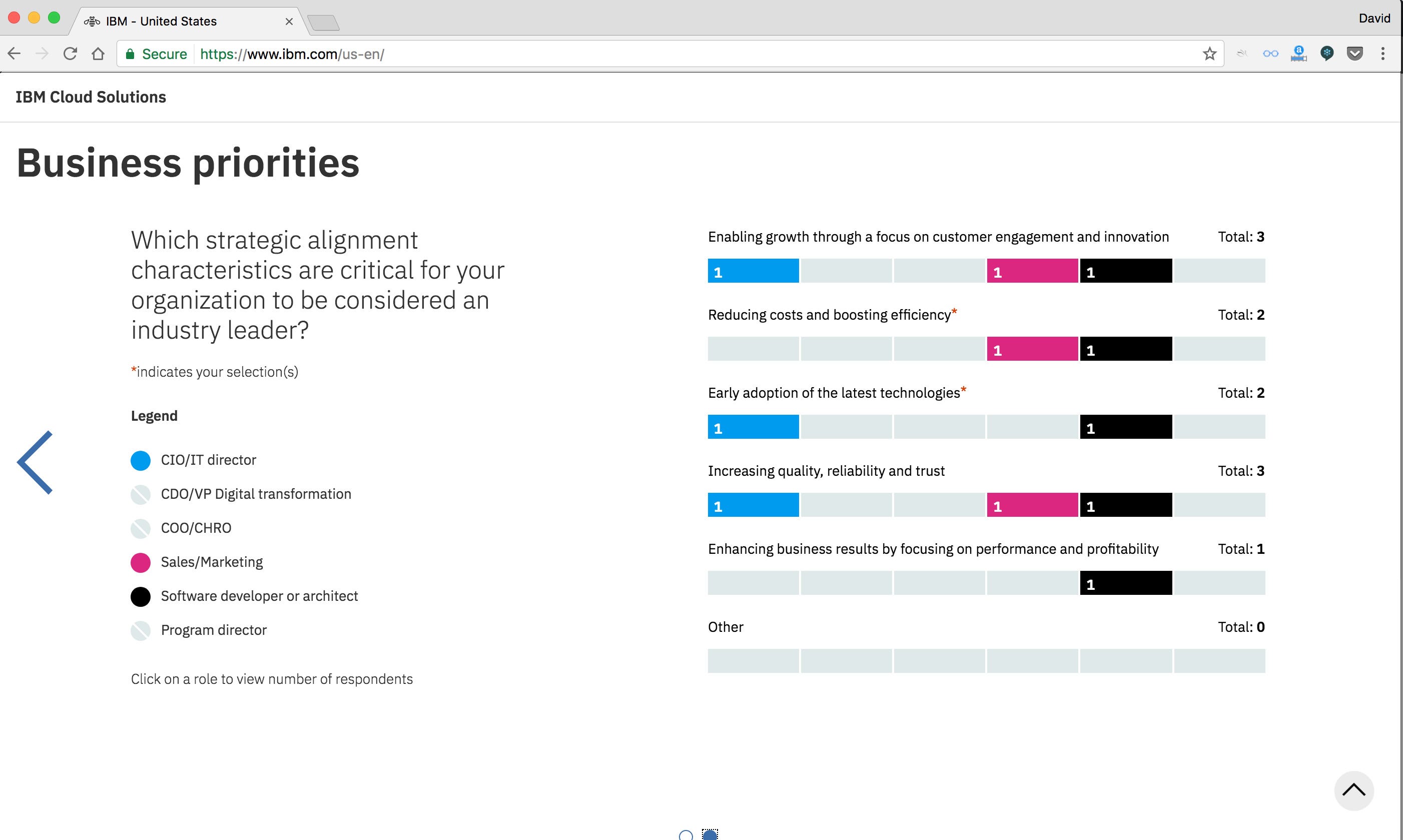
The idea: compare results with teammates, see your gaps, know your steps forward. A shared experience that benefits the audience and the marketer alike with results that illuminate and entire team.

designing the experience


visualization results
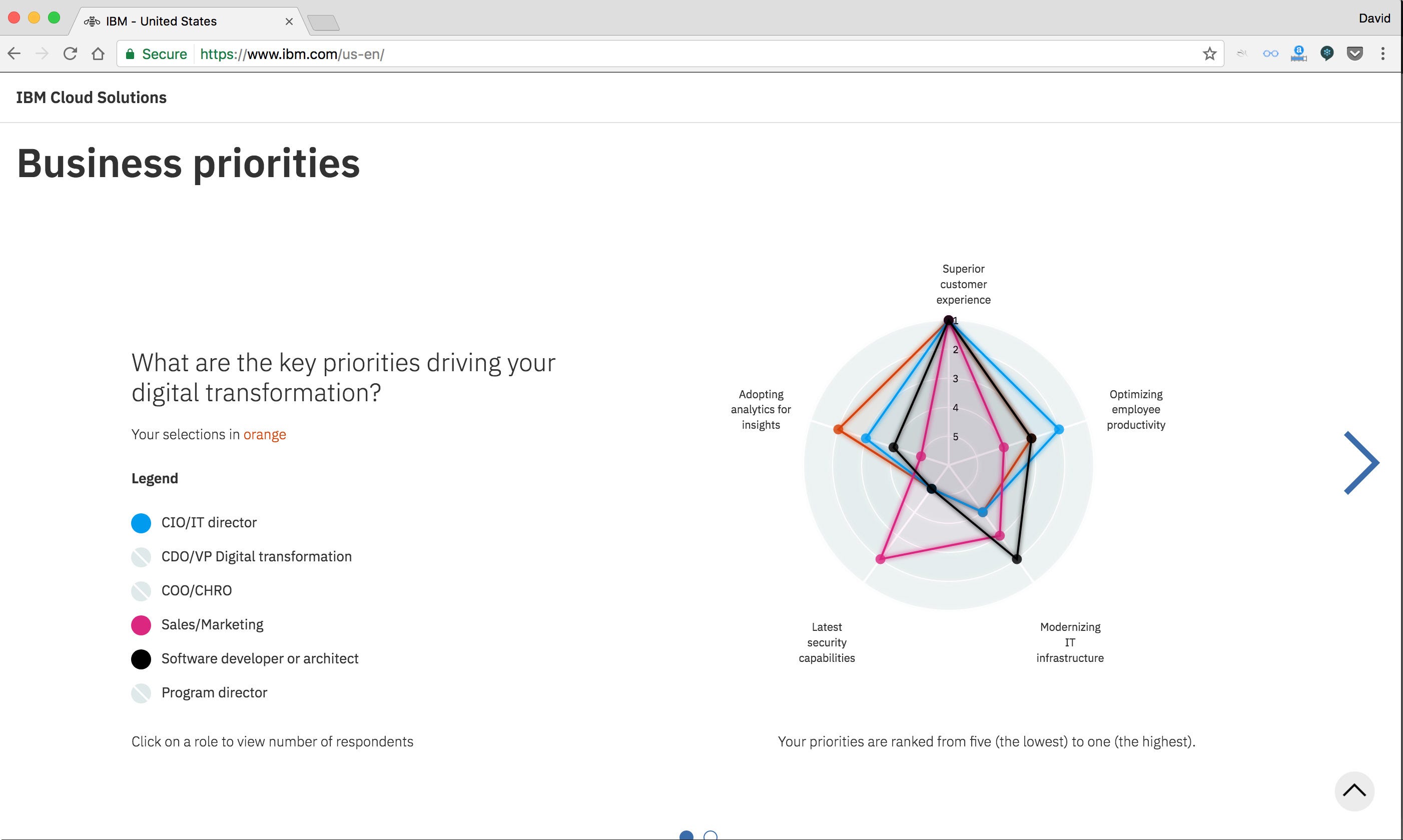
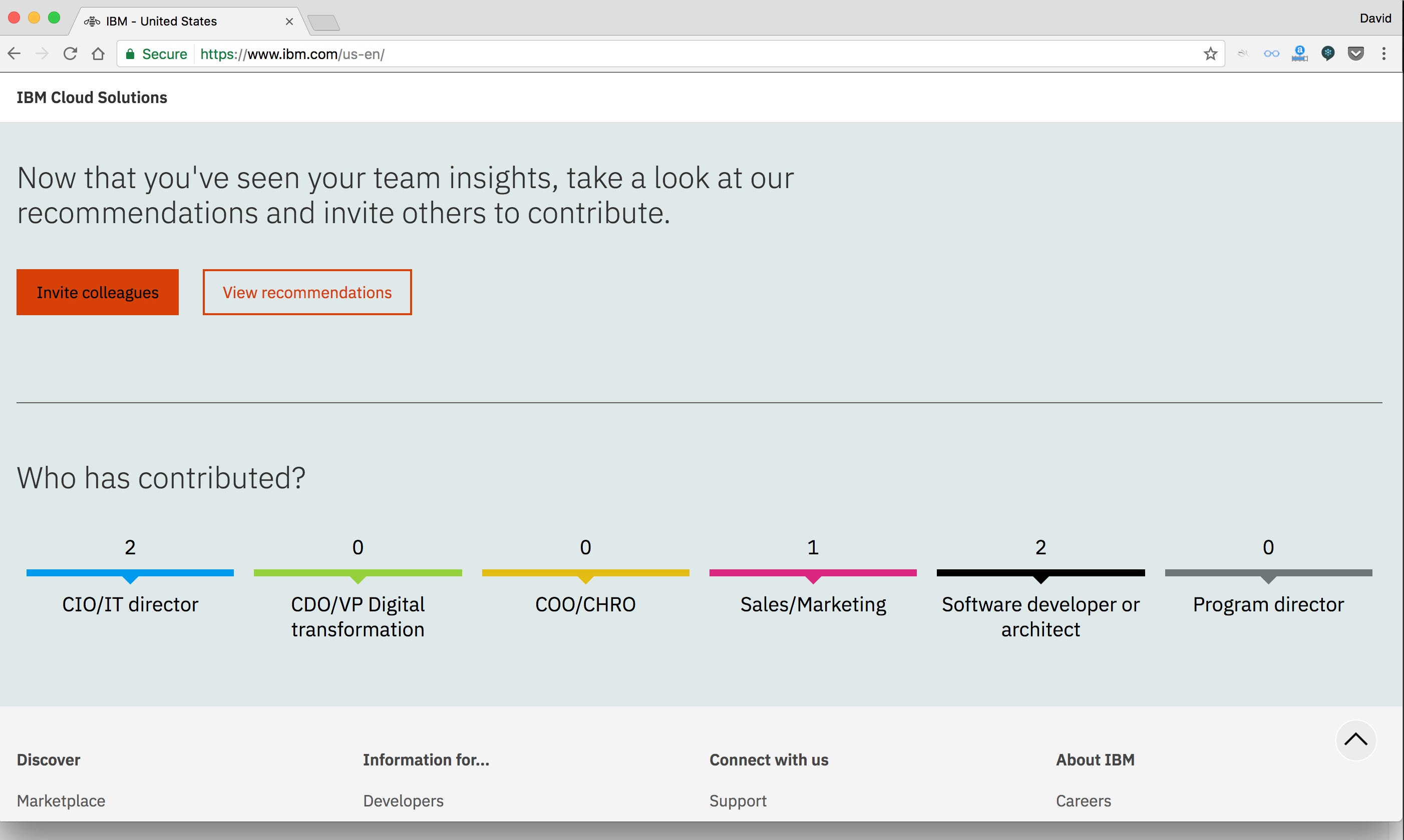
Welcome Watson
Gartner Symposium and World of Watson ˆ
Event activation: creative direction, UIX and visual design
Creative Strategist: Steve Meier/Brett Canfield, Erin McElroy(IBM)
Dev Architect-Connor Hood
Event installation and design — George P Johnson
My role was as Creative Director and UIUX/visual design. I worked with our strategist, lead dev and producer to bring this together over a five week concept-to-delivery rollout for the IBM SXSW Cognitive Studio.
The problem to solve: the buzz around Watson and “AI” was clouded with a misunderstanding of his abilities and possibilities. Businesses rushed to implement machine intelligence without understanding the prerequisites or having a plan of implementation. Telling the story of “with Watson” required clarity for a wide audience and to demonstrate that Watson was not just a solution looking for a problem.
The idea: show the relatable value of Watson APIs through real data and real case studies. Involve the audience in the story of Human and Machine.
make it big. and small.
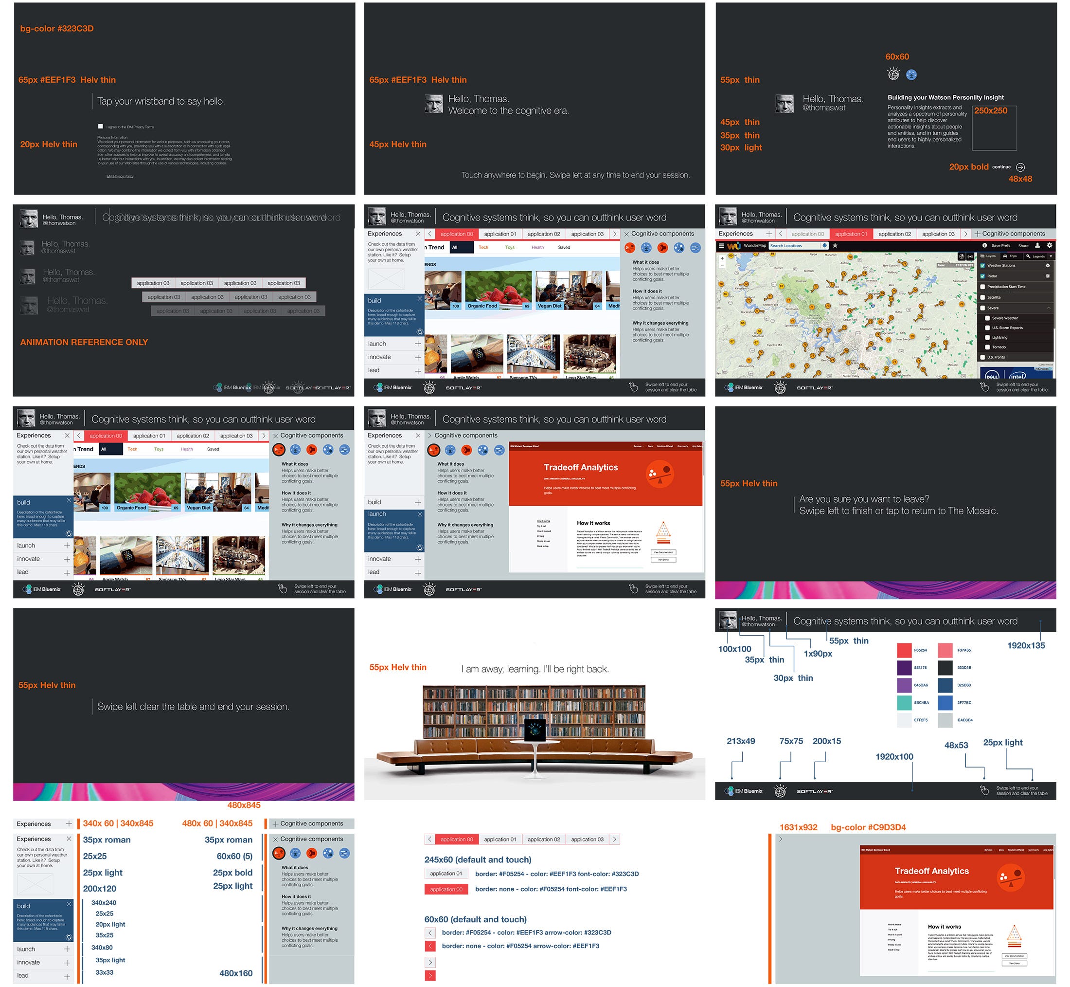
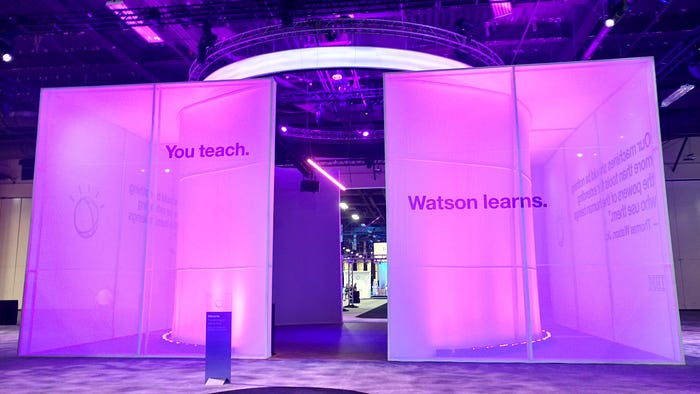
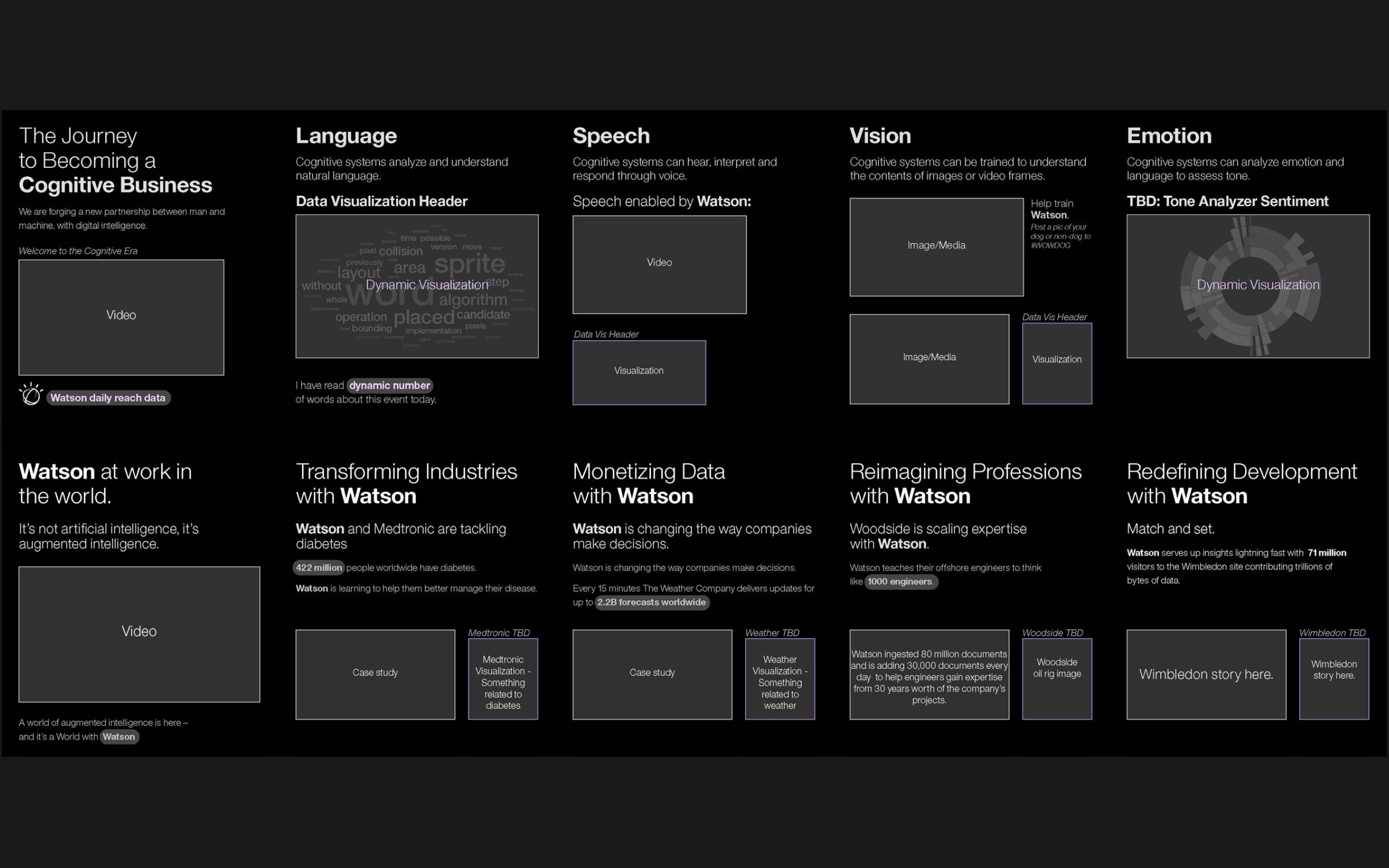
An interactive experience for Gartner Symposium and World of Watson that tells the story of Watson at work, educates the attendee on the components of cognitive and embodies the value of Watson APIs in action.
The task to create a modular, scalable activation that could be used on a single touch device pedestal or on a 40' cylindrical installation started with the content. Let’s all take a moment to give content a round of applause. It makes making so much easier when you have a ends to your means.
the data sources

the footprint plan: Gartner Symposium, Dolphin Hotel, Orlando
The Gartner installations ranged from iPads to video walls [passive] and touch walls [active], so everything had to have a basic footprint that would work on any standard format. Everything was designed to work in a ratios that could scale to size or volume. 1 monitor or 100, the ratios should work for the hardware. Like designing for multiple devices, this was as exercise in give and take to make.
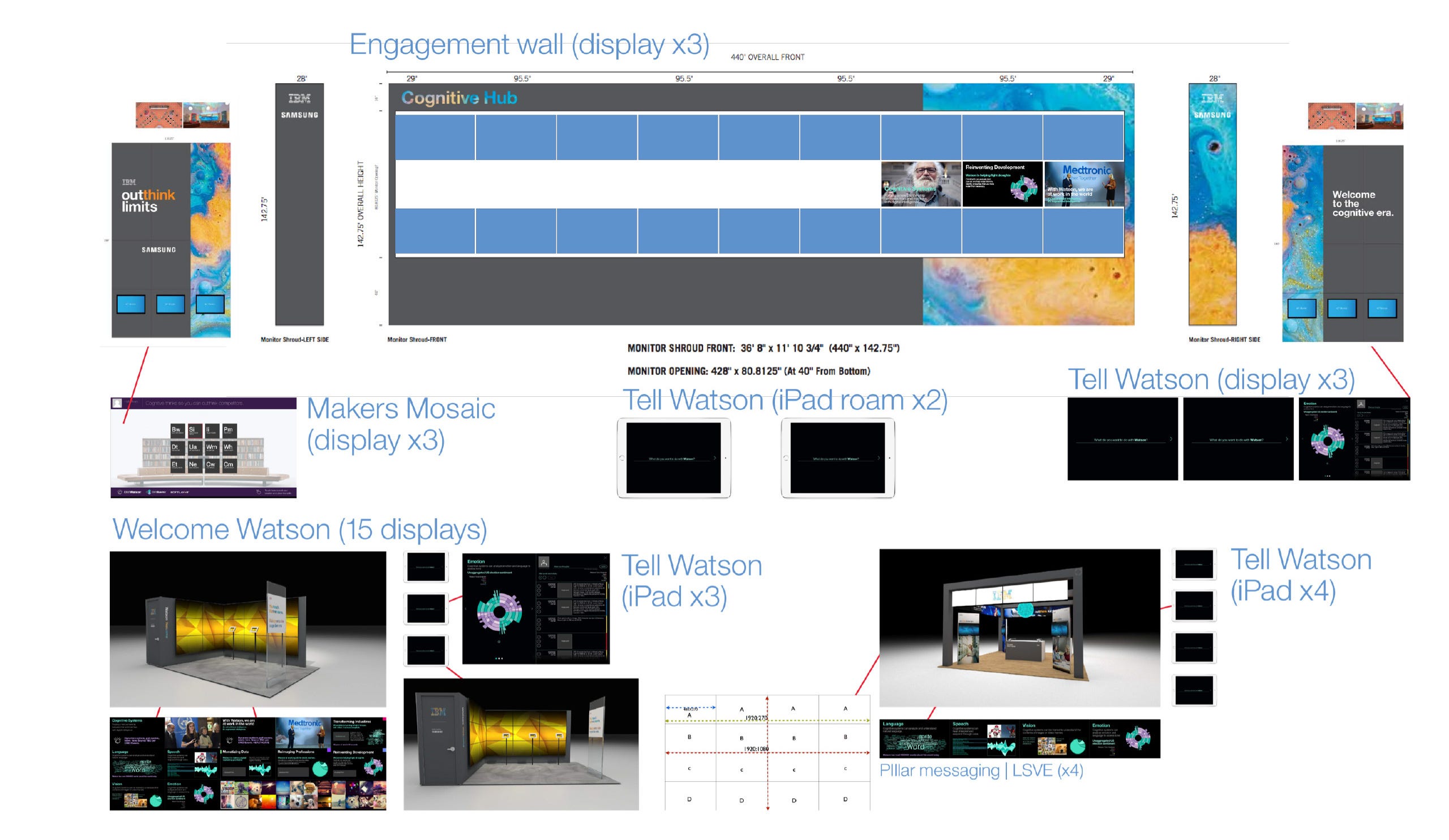

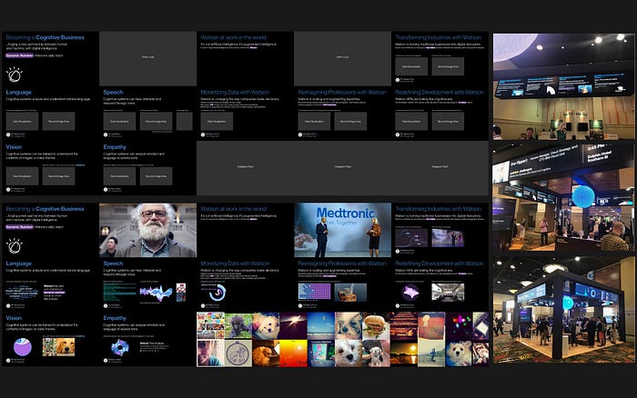
the footprint plan: World of Watson, Mandalay Bay, Las Vegas
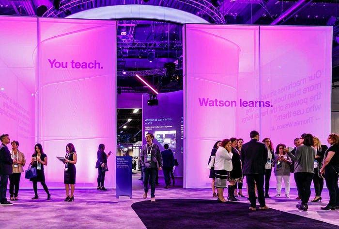
The World of Watson took place less than two weeks later and the activations required a plan for projection on curved, 40' and 22' screens that could be uniquely controlled, each being fed video or data that was constantly refreshed for all five “pillars” throughout the floor.


